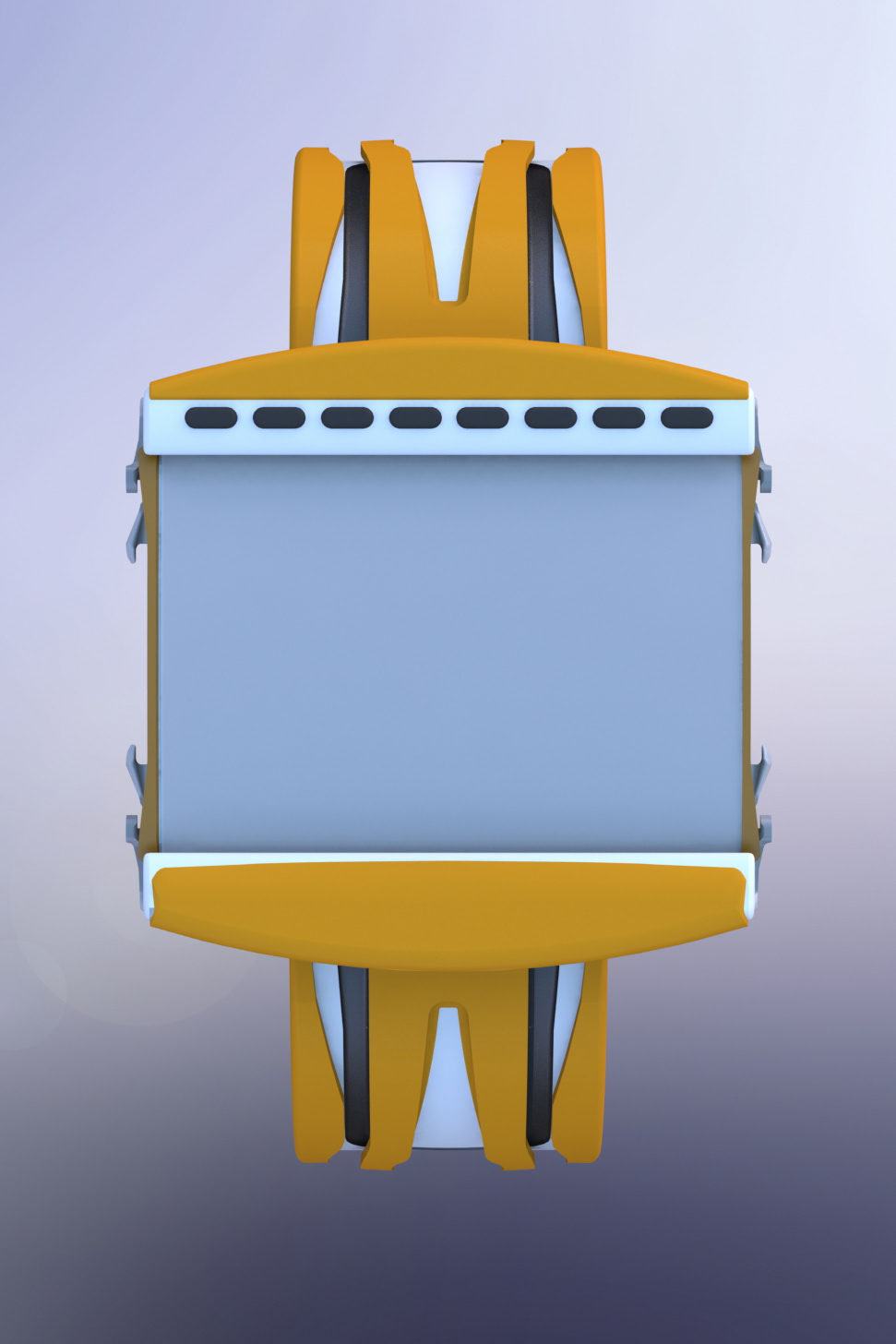
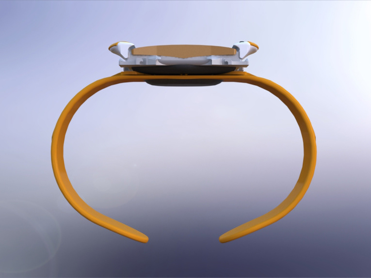
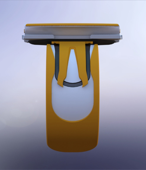
This redesign aims to shift the focus of the product towards the original defining purpose of the sportswatch - to provide the time without interrupting your activity.
After extensive market and user research, it became clear that most watch manufacturers have overladen their products with an enormous number of features. This results in more information to show, which not only means each individual piece of information is harder to view, but also requires more options for user input to navigate; an abundance of buttons.
Multiple small buttons and lots of information both contribute to negatively impacting on two of the most important factors of a good sportswatch according to user research - ease of manipulation and viewing the information that is required.
This research led to the development of a design specification that prioritised maximising the size, position and viewing angle of the screen, as well as ensuring manipulation was easy and unlikely to result in accidental or missed inputs.


